INFLUENCE
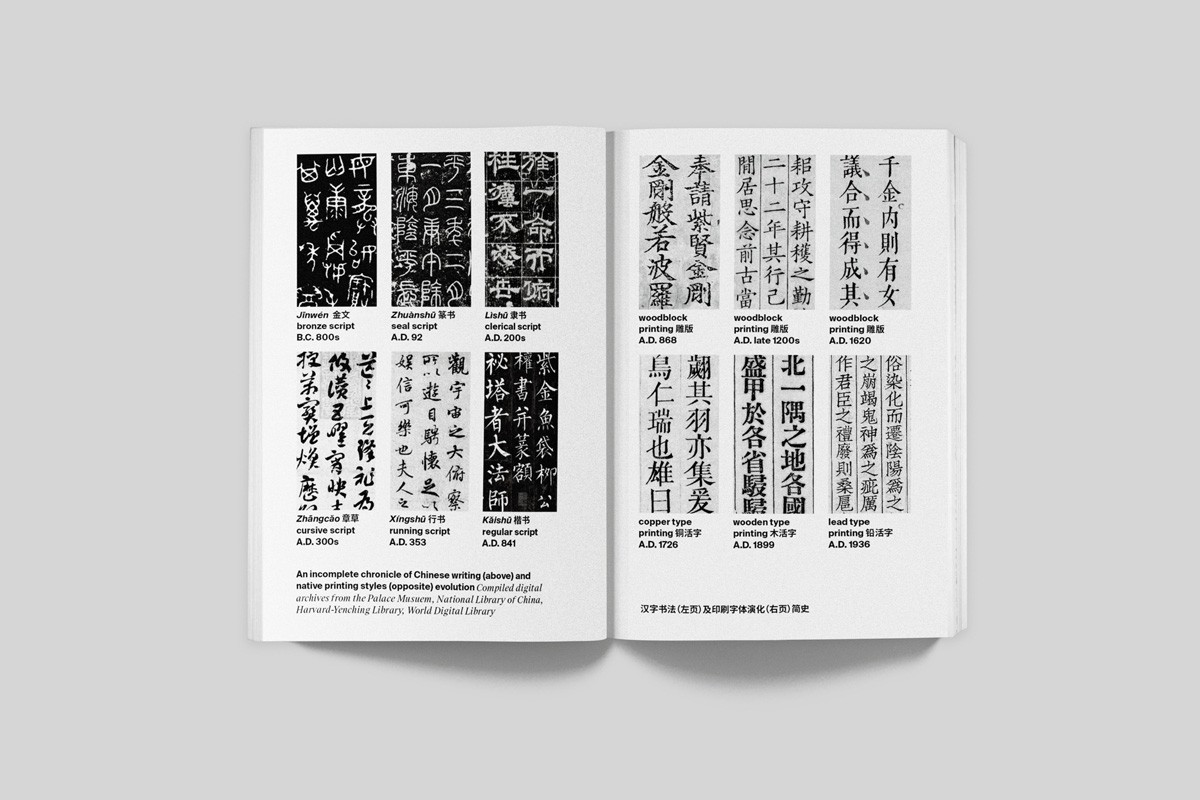
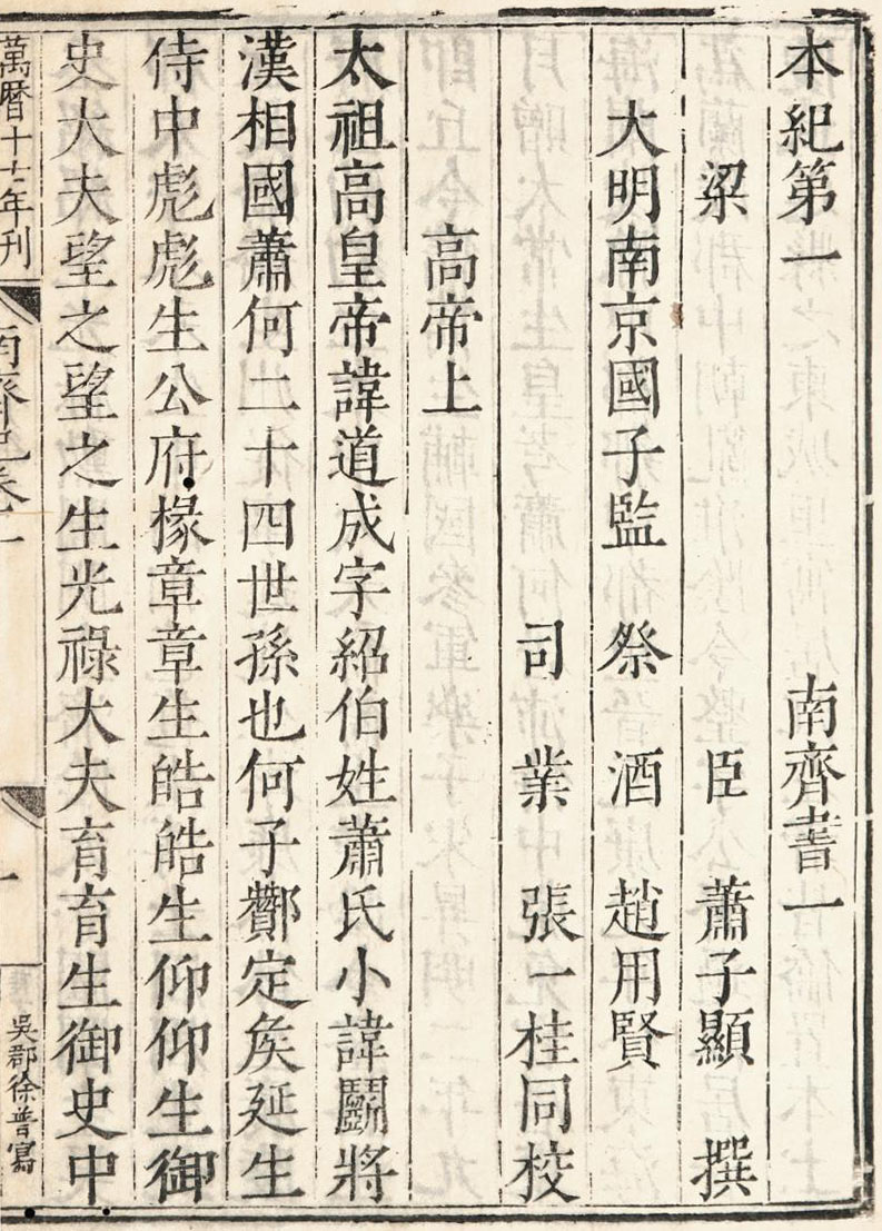
Moveable type was first invented in China.
People would engrave whole pages and illustrations into
wooden or ceramic blocks that would be inked and pressed onto papers.
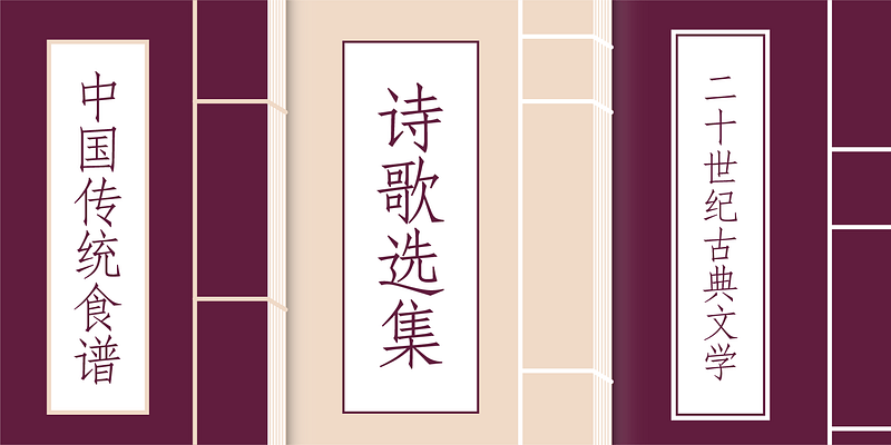
The Chinese language has two different alphabets: traditional and simplified.
Both of these have various applications and scenarios.
People would engrave whole pages and illustrations into
wooden or ceramic blocks that would be inked and pressed onto papers.
The Chinese language has two different alphabets: traditional and simplified.
Both of these have various applications and scenarios.
Had China not invented moveable type and that influence spread towards western countries,
which were then popularized, typography would not have made the progress it has today. Chinese
typography also represents many east asian countries in terms of how it’s presented. It is one
of the languages that can be displayed left to right, up to down, and right to left.
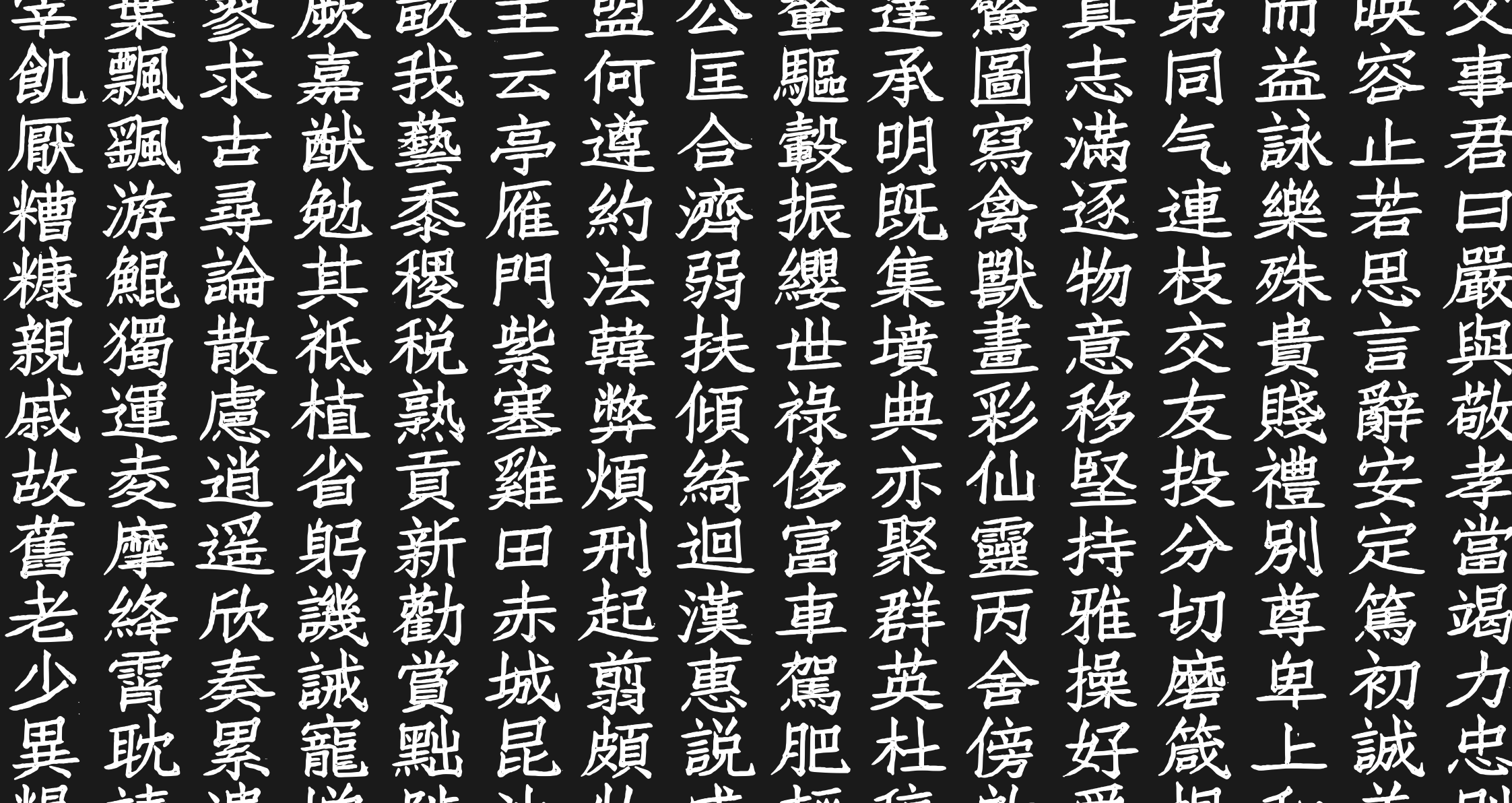
The Chinese language itself has 20,000 unique glyphs that all have their meaning.
Despite being visually pleasing, there is plenty of reasoning for the way that text is presented. It is a language where the order of strokes,
as well as the direction of said stroke, is important.
Despite being visually pleasing, there is plenty of reasoning for the way that text is presented. It is a language where the order of strokes,
as well as the direction of said stroke, is important.
CONTRIBUTION
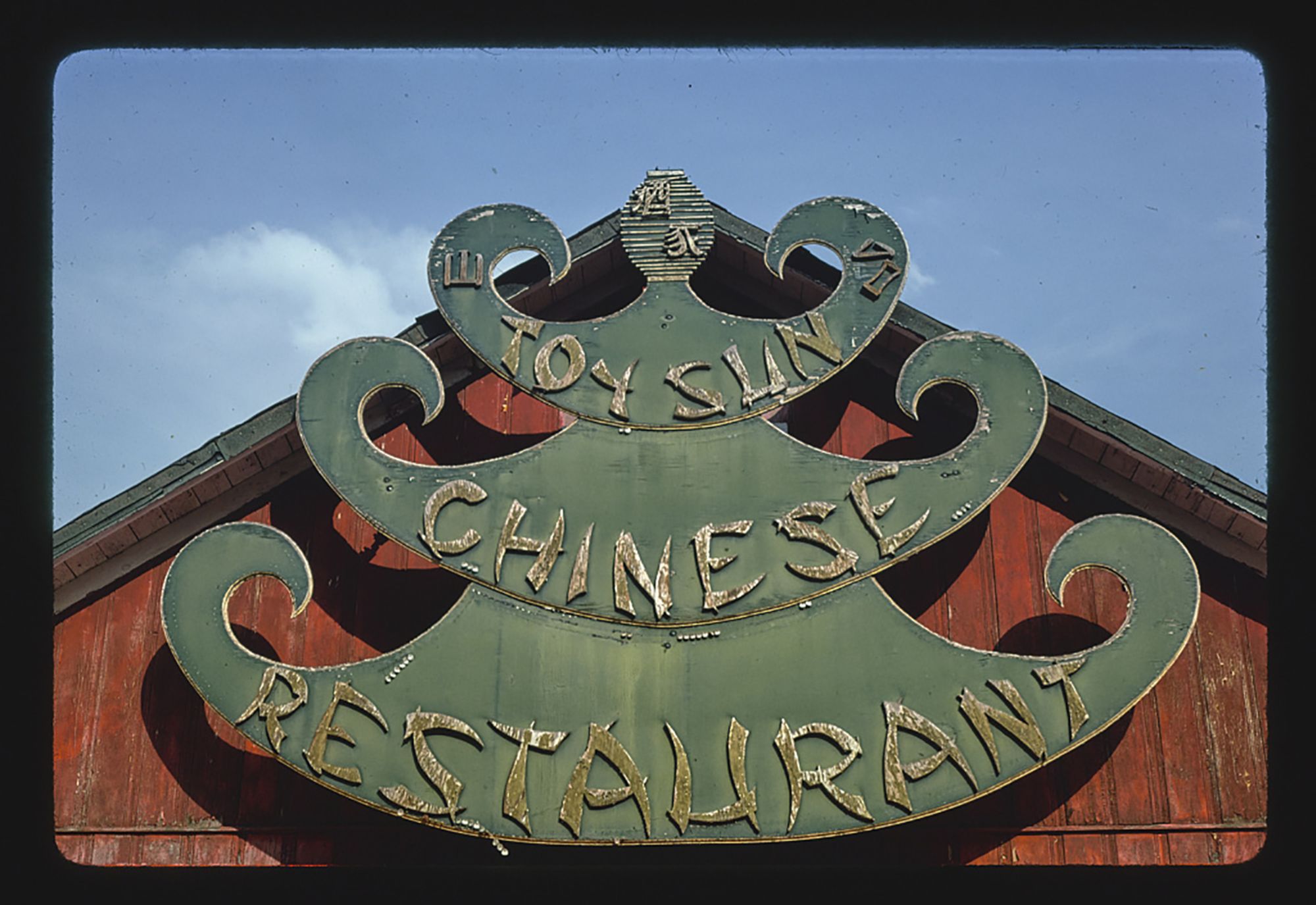
Chop-SUEY
Aside from playing a key factor in the popularization of moveable type,
a specific kind of ethnic font was created
because of the influence of Chinese typography.
Chop suey also has several other names, such as Wonton or Chopstick lettering.
This category of fonts in particular, tend to be named after Chinese food. This font was first used in a Cleveland-type foundry in 1883,
thanks to the slow spread of Eastern culture through Orientalism.
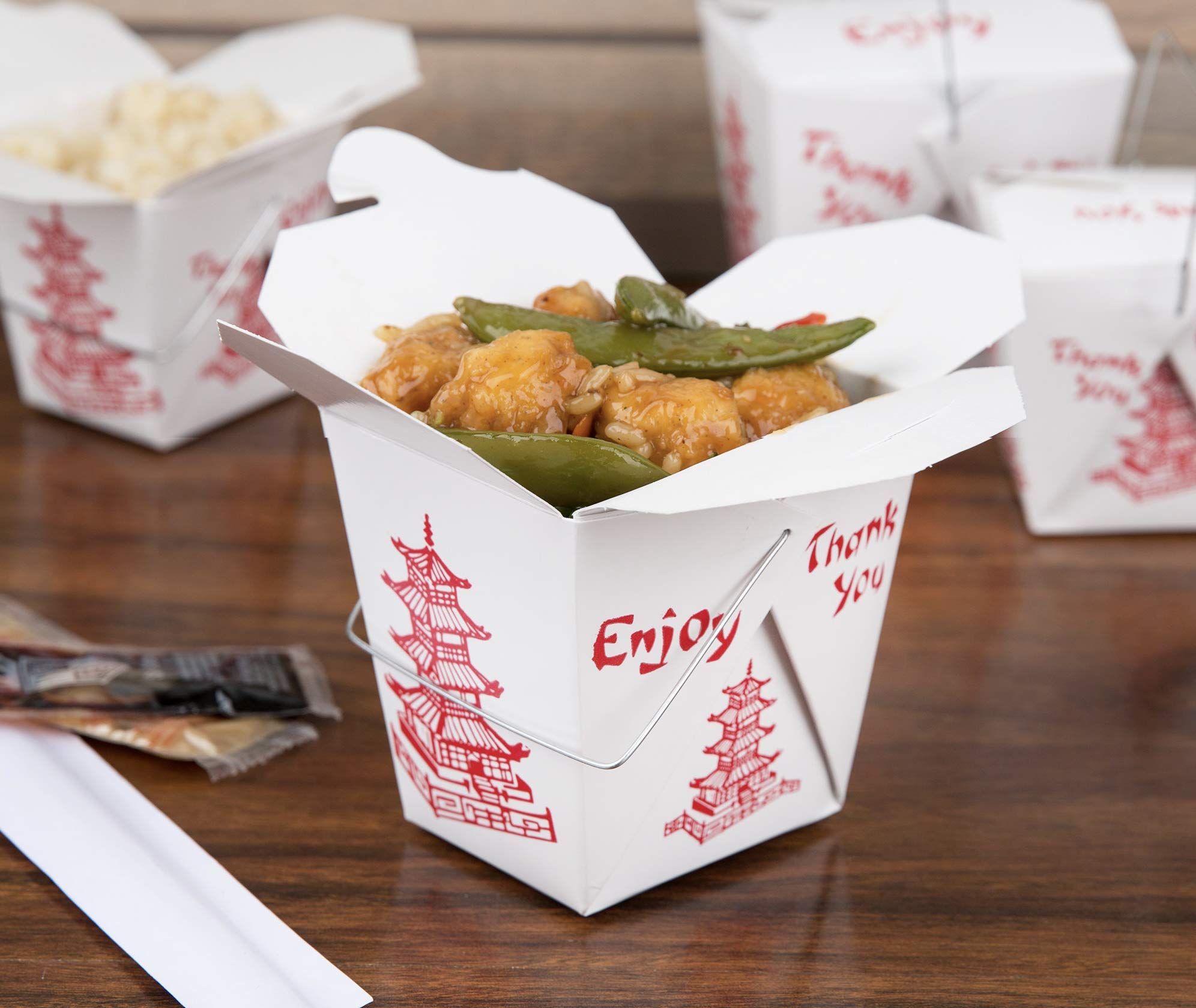
In modern times,
it is a font that is commonly associated with western Chinese take-out establishments.
Establishments that didn’t exist in the country of China itself. The reason that the Chop suey font is recognized
and valued among immigrant Chinese was because the font was a way to attract business.
The font was created in the West to be associated with Chinese culture,
but the font itself completely disregards the importance of the different strokes present in the Chinese language.
They were also arranged in a way that would confuse a native Chinese speaker if they tried
to read the font.
Despite the positive influence chop suey fonts had for introducing the Chinese culture to those outside of it,
it still came with negative events that are still questioned today.
These include use within political Propoganda that negatively impacted Chinese Immigrants in America, or fulfilling certain stereotypes that
some people will find insulting to the Chinese culture.
The history and influence of Chop suey fonts brings up the discussion of the validity
of ethnic fonts among people as a result.
INSPIRE
The Chinese language itself is a font that can be displayed vertically or read right to
left.
The lack of characters or the smaller number of characters being used allows
for more white space and spacing to be present, causing more attention to be drawn towards the type itself.
Chinese typography isn’t affected by Western punctuation either.
The lack of characters or the smaller number of characters being used allows
for more white space and spacing to be present, causing more attention to be drawn towards the type itself.
Chinese typography isn’t affected by Western punctuation either.
The vertical display of type inspired other languages to attempt and try this method.
By displaying text vertically, causing the viewer to gaze top to bottom,
it draws more attention to the text due to this unique and abstract display.
Chinese typography itself doesn’t play by the same rules of Western or the English
language thanks to the lack of periods and other types of punctuation. The elimination of this common rule allows more freedom for the typographer to try more abstract and unique formations of type while also trying to keep the text readable without confusing the viewer. The simple aesthetic also encourages typographers to keep their type simple and not overcomplicate as in some scenarios, less is more and can let the text do the talking.
DESIGN
Fangsongti is a type that is influenced and viewed as a combination of two kinds of
Chinese types.
Those types are songti and kaiti types. Utilizing the thin horizontal lines and
the thicker strokes in the vertical direction common to Songti typefaces. It also has influences
from Kaiti displayed in the way that he strokes of the type itself are not direct but give off
a more handwritten aesthetic for the font. The strokes of Fangsong typefaces are more tilted,
and the presence of serifs also helps to identify this visually pleasing yet simple font.
If I were to find a Western type equivalent to the Fangsonti type, I would answer that it
can be similar to Modern type faces based on the
presence
of flourishes and the contrasting strokes of the lines present in type. But there is no one-to-one equivalent because the history of Chinese type strokes has been
influenced by historical occurrences. When moveable type was first used, the thickness of the strokes was
a direct result of the direction in which the wooden blocks were being carved.
Whether it was along or against the grain of wood, resulting in thinner or thicker lines, respectively.
The contrast between the thin horizontal lines and thicker vertical lines helps make
this font stand out
among others without changing the appearance of the font in the way that display fonts.
This would make the font idea to use in many different applications thanks to the simple appearance of the font.
I really enjoy how this font can be so simple and plain but if used in different ways, can alter the visual appearance, such as using strokes, outlines,
boldening or adjusting the size.
The impact of the font isn’t too affected.
ANALYZE
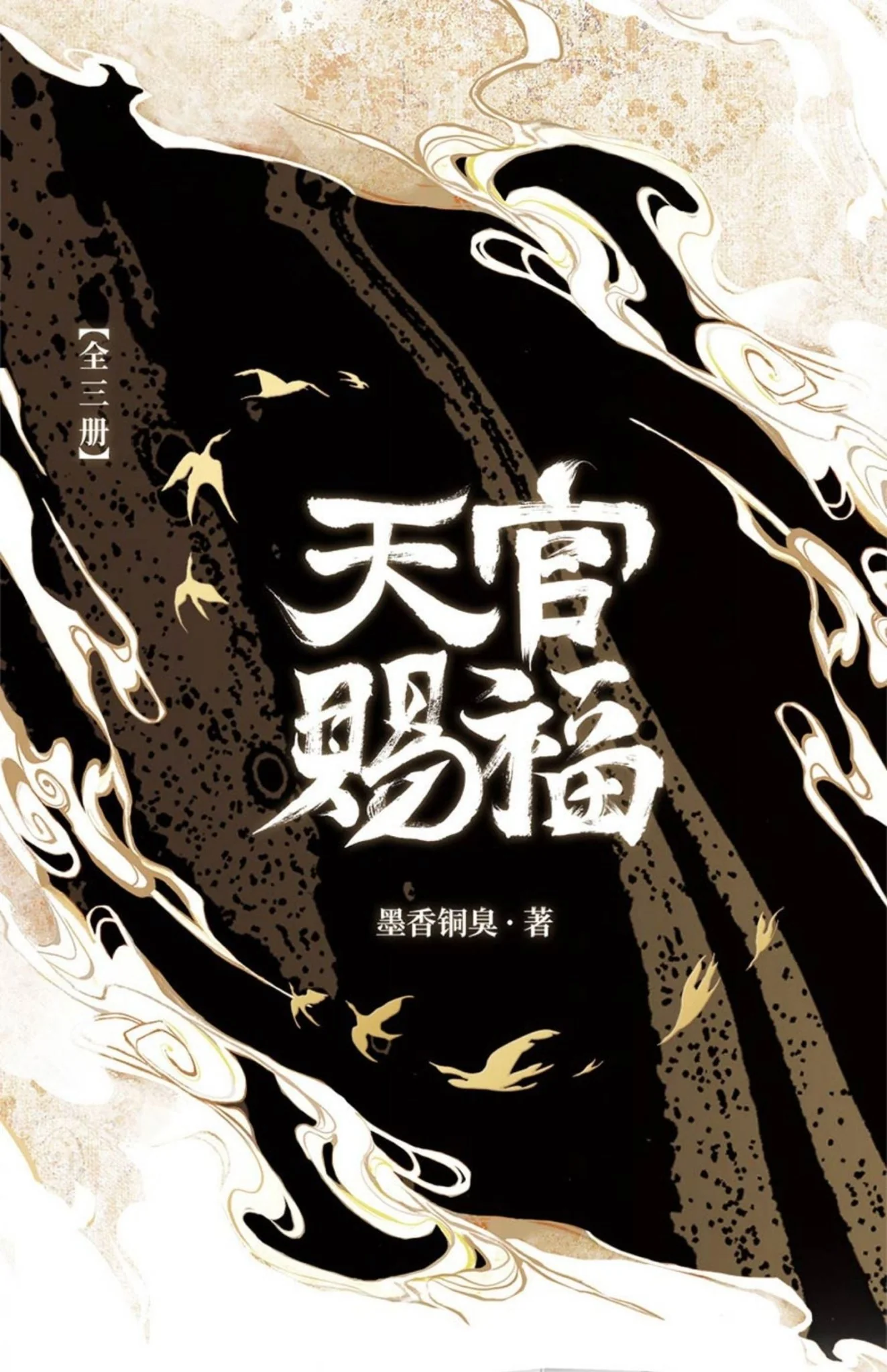
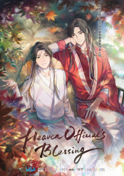
For this type analysis, I picked the logo from an animated Chinese series titled “Tiān Guān Cì Fú” or Heaven Official's Blessing.
The typeface featured in the logo reflects the premise of the show through the use of a traditional-looking font that’s similar to handwritten inked text on paper.
The kind of font that this title would be identified as in Chinese typography classification is Kaiti.
This is a typeface that is identified based on the flowing text that doesn’t cross the line of being a decorative font.
It is spotted based on the handwritten aesthetic and described as elegant.
You can see in the logo that it is handwritten with a brush based on how the stroke
thickness varies; the thickness of the ends is seen as the start of the stroke,
and the thinner flourishes are the ends where the brush is lifted.
The text looks squished, but it doesn’t compromise the overall composition of the logo and instead contributes to the handwritten visuals.
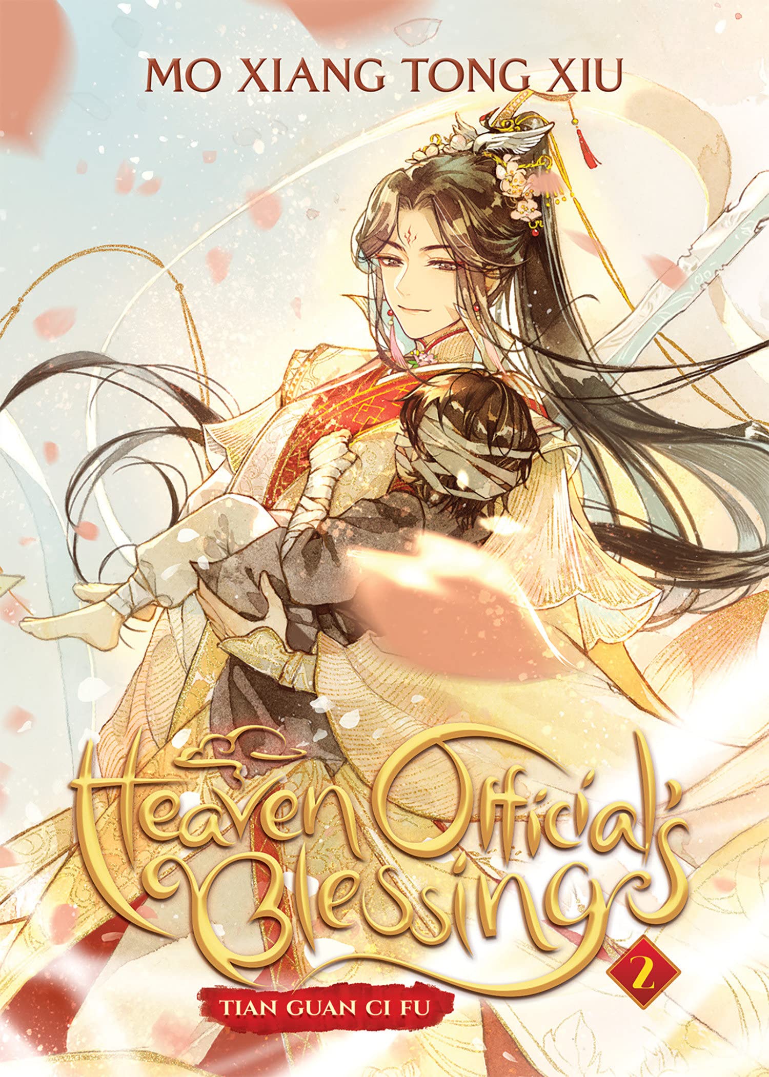
There is also a localized version of this show, with the logo lacking the same handwritten feel and emphasizing more on the flowy text.
Comparing the original and localized versions of the same logo demonstrates the differences in how the typeface is arranged and can result in different visual appeals as a result.
The Chinese logo appeals much more to me when I look at both of them side by side because of the unique strokes and slanted,flowy handwritten type it utilizes while the english equivelent
maintains only the flowy aspects of the original.